
Shed the Unnecessary
Maps
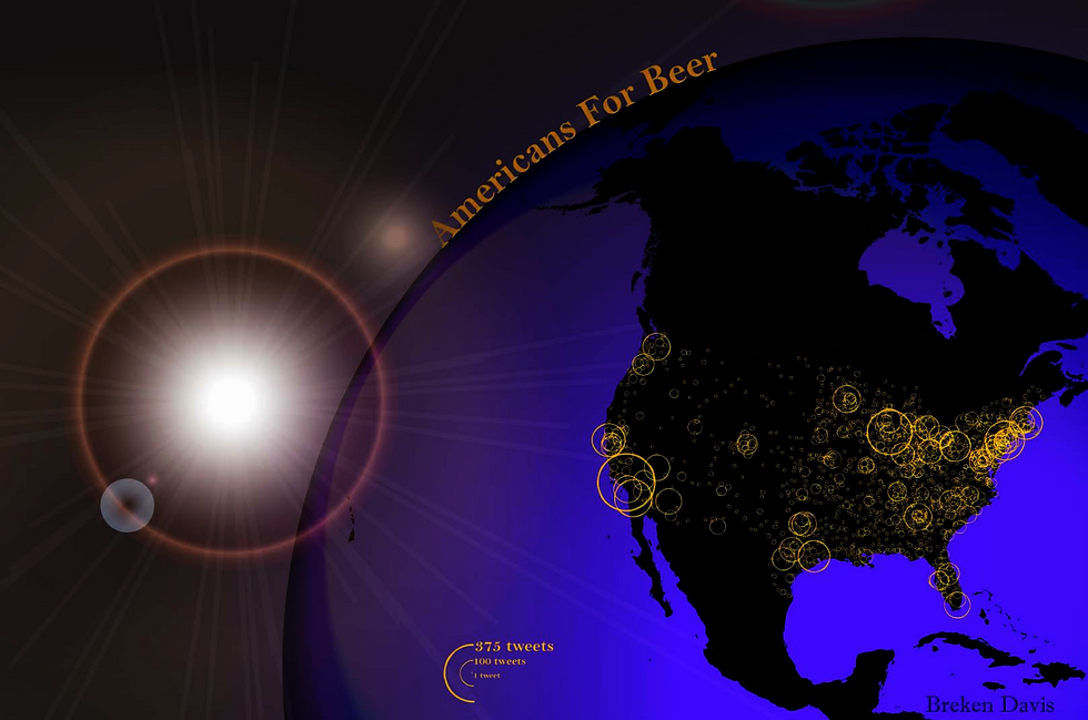
This map uses tweets about beer and maps their occurrence rate shown as a proportional symbol map. It could be used best by commercial retailers and studies on people's actions on Twitter.
I used ArMap to create the symbols and to set the continent in the correct projection in cooperation with Adobe Illustrator where I cleaned it up by adding a gradient mesh, flare and created my legend.
Proportional Symbols
Americans For Beer
My dot density map was the same projection as the proportional symbols map with simliar gradient mesh characteristics and an added background glow effect. However, instead of beer tweets, broadband connections throughout the world was used as my data set. Dot density maps are great for spatial distribution rather than locational accuracy.
Dot Density
Are you Connected?
I have found text maps to be very tedious but ever so fulfilling for those who are not fully adapted to Adobe Illustrator. Text maps do not require ArcMap. Instead, the use of polygons and "type on a path" tool is about it. Text maps add a wonderful design aspect to an otherwise ordinary street map and can be used in many other ways that I personally have yet to discover.
Text Map
Arcata, California
Semester Challenge Project
Extent of Penalty Statute for Rape in the United States
For my final challenge project I chose a topic that isn't so immediately entertaining. I've been interested in our nations involvement with rape cases and decided to fulfill this notion. I used census data from 2011 and research from the American Prosecutors Research Institute. I made a dot density map of the number of aggravated rapes that occurred in 2011 and overlaid it atop a choropleth of the maximum penalty for aggravated/assault rape cases. I probably won't continue on with the subject but it was a good learning experience nonetheless.
This map is an example of using multiple themes at once showing different data sets; GDP in correlation with CO2 emissions by country. Using the Gaster-Newman algorithm in sync with choropleth and superimposing the layer to the geographic layer, anyone can make a cartogram look different. (as long as you have the cartogram extension)
Choropleth
Where Do the Elders Go?
"Where Do the Elders Go?" represents the distribution of HSU alumini throughout the United States by using a basic choropleth map. The data was processed in ArcMap and presented in a conformal conic projection. All editing was done through Adobe Illustrator. This particular thematic map could also be effective in signifying diverging population trends, such as a political map.
Campus
Humboldt State University Walkways
I copied an image of HSU campus from google maps and created a virtual basemap by digitizing all of the buildings, roads and walkways on campus and made points for some trees. Most processes were created and edited in ArcMap, only the title was exported using Illustrator. A digitized map can be used most anything, usually adds a focus to a particular portion of the mapped area, ie the walkways of HSU campus.
Cartogram Choropleth
Carbon Dioxide Emissions in 2004


Wall Map Edits
Ventura County Fire Department
During the summer of 2014, I had the priviledge to work with the Ventura County Fire Dept in their GIS division, helping edit one of their large scale projects called the Wall Maps project. The fire dept was updating all of the fire station wall maps throughout the entire county, in total there were 14 stations originally included in this project.
These are the finished products of the two station maps I personally took part in adding to, editing in ArcMap and practicing the use of editor tools and large databases.

